Here's a great article I wrote on Goethe, Newton, and color. It is unpublished, but you can see my other published and unpublished articles here:
Goethe's Morality of Color
Newton tried to keep color in the realm of an independently provable entity by analysing that light refracted from a prism was separated into a spectrum of colors. He tried hard to maintain objective observations and had an assistant help him make his readings to avoid his own subjective perceptions. He avoided “colors in a dream or what a mad man sees”, and emphasized a quantifiable, objective analysis of color. His works on color and light were published in the much celebrated "Opticks" showing that light was made of colored rays.
It is chemical and physical scientists who have shown the most interest in measuring and studying color, and not the artists who would rather use it rather than analyze it. Yet, alongside the very lucrative paints (and other color industries) which they propagated, these same chemists have realized that the history of color is not just a numerically speculative phenomenon, but involves other values such as emotions and morals to which artists espouse. In fact, the history (or the understanding) of color is closely intertwined with these objective scientists and the more subjective artists.
If one were to place Goethe in this continuum, he would definitely figure at the other end with the artists and other poets of color. Goethe insisted that color should be studied as the human eye perceives it, rather than as instruments measure it. In his unparalleled “Theory of Color Theory”, he spent many experiments trying to show the role our eyes (our perceptions) play in determining the effects of color.
For example, he studied the phenomenon that is now called ‘after-images’ where after looking for a prolonged time at a certain color, when switching to a blank white canvass, we see the ‘contrasting’ color on that white canvass – blue instead of yellow. His premise became that color is not a fixed entity, but depended on many other human and non-human factors in order to be seen. Goethe was convinced that color affects us morally, physiologically, and psychologically; that we react subjectively to color. He eventually started to establish his theory on the ‘morality’ of colors, introducing us to his color polarities starting out with specific colors, and incorporating subjective values on to them: Yellow vs. Blue; Force vs. Weakness; Brightness vs. Darkness; and one is tempted to add Good vs. Evil. Of course, these may only be his subjective views, and another artist may decide that it is red and green that are in such opposition.
Goethe’s emphasis on the perceptions of color, what colors meant, emoted, symbolized, how they affected our senses, feelings and morals influenced the direction and importance of color in painters from there on. Color, up until then, had been give a secondary role to drawing, where line, light and shade dominated. Earlier painters had always delegated a secondary role to color finding no way of equating it with line and form. If Newton were to critic Goethe, I’m sure he would side with these earlier artists and put more emphasis on the straightforward drawing, rather than Goethe’s elusive perceptions of color.
Despite the differences that Goethe found between his and Newton's work, he eventually reconciled these differences, asserting that both objective and subjective views were possible. Newton also had never rejected the idea that color can be a subjective phenomenon. Ultimately, it is this supreme interest in color that unites Newton and Goethe. But Goethe was perhaps more right than wrong in emphasizing the elusive nature of color, and in disagreeing so vehemently with Newton at the beginning of his studies. Color has continued to be as elusive, subjective and ephemeral as he had suspected it to be. Perhaps both Goethe and Newton opened a pandora's box when they decided to put color at the fore-front of their inquiries.
Still , in just a matter of decades, we go from Newton’s predominantly ‘objective’ "Opticks" to Goethe’s ‘subjective’ "Theory of Color". From quantitative measurements to subjective perceptions. How did this come about? Why was Goethe interested in demonstrating the subjective, while Newton insisted on the objective?
I believe it has to do with transcendence. Both Newton and Goethe profoundly understood the human 'will'. Newton wanted it subservient to and Goethe wanted it at the center of man. Newton stressed, in his method of inquiry, that something beyond man determines things. Goethe’s central figure is man himself, and man’s perceptions are the primary factor in his life. It really was a battle between the supremacy of God, and the supremacy of man. In Goethe’s world, man finally wins. By allowing man to focus on his will and whim, Goethe put a stop to this transcendence. Color became the easiest way for artists to win this battle (if they were fighting it in the first place). It was no longer necessary to accurately depict lines and, in Newton’s heroic attempt, colors. Artists no longer had to describe, as best they could, our natural, external world. They could only be expected to personally interpret it, where wilful perceptions finally take over.
Color became a manifestation of the artist’s personal feelings, personal will, personal interpretation and personal desires. Goethe’s "Theory of Color" became the gateway for artists to focus on the much easier human will rather than on Godly transcendence. This led to color being the most important element in painting, and eventually dominating the whole canvass. Later on, this would also result with the distortion of line, form and even content subject to the artist’s interpretation. Color released the artist from any outside commitments, and allowed him to be accountable only to himself. This is essentially the attribute of the modern artist. “What does this mean?” becomes a common question directed at most modern paintings.
Since color is really a manifestation of the modern artist’s personal interpretations, it becomes all about the artist’s feelings. Thus, emotions (or sensations) play a very large part in these paintings. Monet may have attributed his bluish/pinkish haystacks to the time of day, and type of sunlight falling on the dried grass, but it is essentially his subjective and exaggerated interpretation of that particular moment of the day. This later became much more pronounced in his Rouen series, where a blue Cathedral finally exists. This is only a step before Van Gogh’s who tried to “express the terrible passions of humanity by means of reds and greens…” in his Night Cafe. No longer are we subjectively describing a scene, but expressing and interpreting it emotionally as well. Artists even suggested choosing colors "from their palette than from nature".
Feelings are naturally unstable – one is not always happy, or always sad, or always angry. Van Gogh’s deep sense of alienation in red and green could just as soon turn into the calm accommodations of pastels, which he did use in his "Almond tree in Bloom". With nothing to ground these paintings, and focussing on shifting personal sentiments and emotions, artists can say and paint anything they want, and then change their minds about them. Kandinsky, after seeing Montet's variously hued haystacks said, "Deep within me the first doubt arose about the importance of the object as a necessary element in a picture". Now, even the object, the epitome of form, is no longer required as a reference to the external world. The artist can draw anything he wants, and color it anything he desires. Even the title to Kandinsky's paintings is indicative of this belief.
With no external responsibilities, or a sense of transcendence to force these artists beyond the self, this battle of relevance has now raged for more than a century. I think it all started when color, that fickle, deeply personal, ephemeral quality, took precedence over the drawing. When previous attempts at objectivity were superseded by subjectivity. This unwillingness to face the difficult external world, and perhaps humbly attribute it to something greater than oneself, changed the focus of the artist from the external world to his internal landscape. The color field aritsts of the 1960s epitomize this attitude, where nothing but color dominates the whole canvass. This has been the saga of modern art.
References:
Gage, John. Color and culture : practice and meaning from antiquity to abstraction. Boston ; Toronto : Little, Brown and Co., c1993
Goethe, Johann Wolfgang von. Goethe's color theory / Arranged and edited by Rupprecht Matthaei. New York : Van Nostrand Reinhold, 1971.

Showing posts with label Art Criticism. Show all posts
Showing posts with label Art Criticism. Show all posts
Wednesday, April 11, 2018
Art and Empty Spaces: Part 1

Shellie Zhang in front of the window display of her Neon artwork "A place for Wholesome Amusement,"
At Fentster Gallery at 402 College St. until May 22, 2018
[Image Source: The Canadian Jewish News]
-------------------------------------------------------------------------------------------------------------
[Part Two here]
There's a hilarious, short-lived, "dialogue" at the Art Gallery of Mississauga Facebook page.
Given the contemporary history of Facebook, it might be deleted some time soon, so I have it here as a jpg.
The Facebook screenshot (the jpg) is below the "dialogue" which I have transcribed:
Art Gallery of Mississauga-------------------------------------------------------------------------------------------------------------
April 4 at 1:05pm
"In this space beyond the residual is a form of collaborative remembering, a narratology shaped by the resilience of past #cultural texts and the desire for future pluralistic frameworks. Side by side, the two marquees, in their proximity, propose a kind of #kinship, a way to engage in a cross-cultural collective #memory."
Annie Wong discusses #Auction artist Shellie Zhang's new neon #installation on past spaces and parallel histories for Canadian Art.
Shellie Zhang Recovers Spectral Traces from a Diasporic PastDavid Alan Hill
The artist's new neon installation explores parallel histories between Toronto's Jewish and Chinese communities.
CANADIANART.CA
Is this statement really in any form that would engage interest from the average viewer?
What a waste.
Art Gallery of Mississauga
Thanks for your comment David.
This new work by Shellie Zhang, as articulated by Annie Wong in Canadian Art delves into the multiple histories of one space, 285 Spadina. This space is located in an area of Toronto that was once home to many immigrants who experienced normalized racism while trying to make a life. Zhang’s neon work asks an open-ended question to all who encounter its glow on the practice of remembering: how does displacement and diaspora of the past relate to the lived experiences of today?
David Alan Hill
this does shed some light on the work in a more comprehensible manner but still it is a problem to me that the descriptions are so elitist for average people. After all they are the viewers as well as the educated group that float around the art world. Lets be inclusive and not restrict the art experience.
Ian Crysler
Gallery babble, very unattractive.

Jpg screenshot below:

David Alan Hill somewhat captualted under the pressure of social media (he should blame Mark Zuckerberg for that, LOL). But he should have hung in there. What exactly is the dialogue between two neon lights? What passerby will try (or care less about) deciphering these cryptic messages about empty spaces (apparently - what exactly is "exhibited" there anyway?)
Thursday, March 8, 2018
Getting "The Shape of Water" All Wrong
Below is a rambling article which I have cut down to its bare essentials by the rambling author at VDare, Steve Sailer. I understand that VDare is concerned with issues and stories surrounding immigration, but Sailer completely glosses over the real story of this movie: alien/human copulation.
Sometimes race and immigration aren't everything. We have now filmmakers explicitly showing a completely different type of "invasion" with an open acceptance of nefarious and satanic themes.
------------------------------------------------------------------------------------------------------------------------
Trophy Wife
Steve Sailer
March 7, 2018
Taki Mag
The Shape of Water’s plot is: A Democratic Party Coalition of the Fringes (a disabled woman, a gay man, a black woman, a Jewish Communist Russian spy, and a fish) unites to defeat the GOP Core American cishet evilest evil white male of all time (besides Trump, of course). Square-jawed white man Michael Shannon plays the epitome of hateful hate-filled white whiteness who epitomizes his white male privilege by peeing on the floor.
[...]
Perhaps the pandering politics of this movie is just del Toro’s Safe Space for what he really cares about, which is colors. Nobody who matters is going to give del Toro trouble for his hate-whiteyness, and that frees him up to obsess over the colors he really cares about: not partisan red vs. blue, but red vs. green. The Shape of Water is constructed around a color scheme where red represents the beloved nostalgic past and green signifies the hideous technological future.
If genius is an infinite capacity for taking pains, then del Toro is a genius at imposing his childlike fanaticism about how red is his favorite color and green is his most hated color on every single frame in the movie.
On the other hand, I kind of like green. I’m trying to get my lawn to turn green now that it has finally started raining in Southern California.
Granted, I’m not as aesthetic or as stylish as del Toro.
[...]
...Guillermo del Toro (who is not to be confused with the very cool Puerto Rican actor Benicio Del Toro) is sort of the Mexican Tim Burton, if the Burbank-born Burton weren’t quite so swarthy. Del Toro looks about as pale as the late Philip Seymour Hoffman, an early fatality in the ongoing White Death.
...Guillermo del Toro (who is not to be confused with the very cool Puerto Rican actor Benicio Del Toro) is sort of the Mexican Tim Burton, if the Burbank-born Burton weren’t quite so swarthy. Del Toro looks about as pale as the late Philip Seymour Hoffman, an early fatality in the ongoing White Death.
[...]
At the Oscars, del Toro announced that he was an immigrant and that the purpose of art was to “erase the lines in the sand.” Yet del Toro seems to value being able to secure his daughters north of the line in the sand between the Lovecraftian madness of Mexico and the sane safety of suburban America.
It’s almost as if del Toro finding refuge north of the border...is what Trump meant by implying that our immigration system should be reformed so that Mexico is sending their best.
Tuesday, February 21, 2017
The Postmodern Art Critic

Roy Lichtenstein (American, 1923–1997)
Title: Art Critic, 1996
Medium: Prints and multiples, Screenprint
Edition: 150
Image size: 19.72 x 13.35 in
Catalogue: Joseph Fine Arts Inventory Catalogue
Contemporary art criticism is a fascinating subject.
No-one dares touch it save for the few allocated to it because:
- They have a bullying manner
- They went to the "right" schools and studied the "right" kind of art
- They support the "right" kind of art, which now is post-modern, nihilistic anti-art
- A multicultural viewpoint also helps quite a bit
The idea really is to displace western art and the western art tradition.
But the essential point of excellence is missed.
Measuring excellence is not a culturally loaded task.
The idea of excellence originated in western thought, guided by Christian philosophy.
So the true art critic bases his judgment on western tradition within a Christian context.
Saturday, December 17, 2016
I wrote in my last post A Basic Guide to Liberalism and Conservatism, Part I: From the Orthosphere:
-----------------------------------------------------------------------------------------------------------------------
What Life Is Like For Artists In The Time Of Trump
By: Maureen Mullarkey

“I am an artist, you know. It’s my right to tell you what to think. I’m chosen. You’re not.” That is the nutshell version of a long-standing effort to wrest art away from bourgeois aesthetic concerns and onto political ones. This tug is at work in every branch of the arts. But for economy’s sake, I will keep to the words art and artist as shorthand for the range of disciplines.
Today’s arts culture—the segment of it that appeals to museum curators, faculty hiring committees, and awards panels—mimics the intellectual fray of the 1960s, itself an imitation of contests begun in the 1910s and ‘20s. From the 1909 Futurist Manifesto, through assorted utopian declarations of the 1960s, on to the hectoring of Mike Pence by the cast of “Hamiliton,” artists have been on a steady, determined march toward ideological preachment.

“The truth of art,” wrote Herbert Marcuse, “lies in its power to break the monopoly of established reality to define what is real.” What is taken as real by graduates of university art departments are the biases that flatter the university’s view of itself as a progressive institution. Coloring that view is the old myth of the artist’s divine spark, a tradition fuelling the mystique of an avant garde.
It is a heady brew. It repudiates inherited models of aesthetic worth, dismissing hard-won mastery as technical hokum. At the same time, it seduces art majors—novel creatures, historically—to see themselves as an intellectual class commissioned to awaken audiences from acceptance of the status quo. The ultimate aim of the contemporary artist’s training is not facility, not ease with one’s métier, but the political or social message. Since there is no end to things to be anguished about, Hope ‘n’ Change can last forever.
I Thought Artists Were Against Censorship
Right now, the art-and-culture bubble is iridescent with gloom. Election Day was an alarm to mobilize combatants in the culture war to lift the yoke of our oppression. Here in my inbox is a “Dear Colleague” letter from the board of the U.S. chapter of the International Association of Art Critics (AICA), a nongovernmental organization founded in 1950 by the newly formed United Nations:
Someone forgot to tell the board of directors that their preferred candidate thought there ought to be a law, with federal penalties attached, against controversial entertainment—including movies that criticize a politician named Hillary Clinton. This same board stood proud when AICA held its annual international congress this past October at the Museo de Belle Artes in Havana, where freedom of thought and expression are non-issues.
The eminent College Art Association (CAA) encourages attendance at its 2017 Annual Conference with this: “Given the political climate in the United States right now, CAA knows it is of utmost importance to address issues at the intersections of race and contemporary art, colonialism in art history, and the Black Lives Matter movement at the 2017 Annual Conference.”
Conference highlights include a discussion on “Public Art in the Era of Black Lives Matter;” “Picturing Social Movements from Emancipation to Black Lives Matter,” a panel titled “Post-Black and Liquid Blackness” in contemporary African American art; and a talk by Evie Terrano, PhD, an art historian whose topics include challenging the authority of the Confederate flag.
Brushes Aside! We Have Politics to Do
Trump’s victory has affected even the artists’ listserv I belong to. The list began as a handy way to circulate useful information among visual artists in and around New York City. It affirms Picasso’s contention that only critics natter about form and content. When artists get together, they just want to talk about “where to buy cheap turpentine.”
Postings usually keep to methods and materials, the cookery of things. (“If your umbers are drying too quickly, try a little clove oil.”) Subscribers help each other out with the vital questions: Who has the name of a low-cost art mover? What are they paying studio models these days? Can anyone recommend a plumber?
But since Election Day, politics has been gaining ground. This is every cultural worker’s hour to repudiate formalist hocus pocus and encourage solidarity in the arts in service to the noble cause of building . . . no, not communism. Just left-leaning liberalism epitomized by the First Woman not-yet-President.
A December 3 broadcast touted an “action plan” to stop Trump. Remember, he still has not been elected. That happens in the Electoral College on December 19. There were only 16 days left.
Innocuous ornaments like the easel-picture could wait. Better to sign and distribute an Electoral College petition to make Hillary president. Initiate individual contact with specific electors. Keep this Change.org petition in the public’s consciousness by contacting TV stations, reporters, and bloggers. Organize and direct grassroots action; man phone banks; write letters. Promote protests in state capitals on December 19.
A fabric artist—whose hand-stitched work eyeballs the worldwide immigrant crisis, gun violence, health care, and marriage equality—stepped forward to offer her own efforts to the new cause:
In addition, participants are encouraged to donate to four recommended charities. The character of Westbeth’s policy preferences is clear in their selected endorsements: Planned Parenthood; the Ali Forney Center for gay and transgender teens; God’s Love We Deliver, a service for HIV/AIDS patients; Cabrini Immigrant Services, a boon companion to illegal aliens seeking social services.
You’re Fueling Trump Again, People
Dark times are upon us. Now more than ever, artists are needed to save us from the snare and the pit. An excerpt from one painter’s lengthy morning-after listserv reflection illustrates the current sense of mission:
It never occurs to the arts community that it has no more political insight or civic savvy than its neighbors. Like the “anti-fracking community,” the fraternity might have less. Its image of itself as occupying a privileged place in the moral universe is a distorting lens through which self-congratulation looks easily like discernment.
Your ‘Education’ Consists of Indoctrination
Stay for a moment with that term better educated. There is humor in that. Since the post-World War II era, when art training began to shift in earnest from the atelier to the campus, artists have breathed the same infantilizing culture that infects academia.
Consider the University of Delaware’s current pitch for its master of fine arts program. Second-year MFA students are invited to a 9-day frolic dubbed “Barefeet and Birthday Suits: MFA in Berlin.” Tuition is free for this “unique international experience partially funded by private charitable donations.” (Any wonder why millennials went for Bernie Sanders?)
Imagine a program for medical or law students hawked in terms more suggestive of a nudist colony than professional expertise. But then, expertise is an outmoded concept in an area of activity to which the word discipline is hard to apply. Painters, sculptors, and gifted craftsmen still exist. But they are outnumbered by contemporary artists adrift in a sea of undifferentiated “practices,” a portmanteau word for holding whatever posture an MFA drops into it.
By their Post-It notes you will know them.
-----------------------------------------------------------------------------------------------------------------------
Maureen Mullarkey is an artist who writes on art and culture. She keeps the weblog Studio Matters. Follow her on Twitter, @mmletters.
Photo Photo by Maxwell Leung for CAA
Photo William Murphy / Flickr
I have made a major decision in the way I am to approach recent events. And as my last few posts show, I am getting a shower of support! Is this a sign from God :).Well here's another one from The Federalist:
-----------------------------------------------------------------------------------------------------------------------
What Life Is Like For Artists In The Time Of Trump
By: Maureen Mullarkey
Donald Trump’s victory has affected even the artists’ listserv I belong to. A December 3 broadcast touted an ‘action plan’ to stop Trump.

“I am an artist, you know. It’s my right to tell you what to think. I’m chosen. You’re not.” That is the nutshell version of a long-standing effort to wrest art away from bourgeois aesthetic concerns and onto political ones. This tug is at work in every branch of the arts. But for economy’s sake, I will keep to the words art and artist as shorthand for the range of disciplines.
Today’s arts culture—the segment of it that appeals to museum curators, faculty hiring committees, and awards panels—mimics the intellectual fray of the 1960s, itself an imitation of contests begun in the 1910s and ‘20s. From the 1909 Futurist Manifesto, through assorted utopian declarations of the 1960s, on to the hectoring of Mike Pence by the cast of “Hamiliton,” artists have been on a steady, determined march toward ideological preachment.

“The truth of art,” wrote Herbert Marcuse, “lies in its power to break the monopoly of established reality to define what is real.” What is taken as real by graduates of university art departments are the biases that flatter the university’s view of itself as a progressive institution. Coloring that view is the old myth of the artist’s divine spark, a tradition fuelling the mystique of an avant garde.
It is a heady brew. It repudiates inherited models of aesthetic worth, dismissing hard-won mastery as technical hokum. At the same time, it seduces art majors—novel creatures, historically—to see themselves as an intellectual class commissioned to awaken audiences from acceptance of the status quo. The ultimate aim of the contemporary artist’s training is not facility, not ease with one’s métier, but the political or social message. Since there is no end to things to be anguished about, Hope ‘n’ Change can last forever.
I Thought Artists Were Against Censorship
Right now, the art-and-culture bubble is iridescent with gloom. Election Day was an alarm to mobilize combatants in the culture war to lift the yoke of our oppression. Here in my inbox is a “Dear Colleague” letter from the board of the U.S. chapter of the International Association of Art Critics (AICA), a nongovernmental organization founded in 1950 by the newly formed United Nations:
We’re getting in touch to let you know it is time to renew your membership. But first we’d like to say how deeply troubled and saddened we are by the responses of hatred that we’ve been seeing and hearing about following the results of our presidential election. One of AICA’s founding principles was a statement against censorship. As art critics and writers, we are committed to contribute to mutual understanding of visual aesthetics across cultural boundaries, and to defend impartially freedom of expression and thought and oppose arbitrary censorship. We can’t know what 2017 will be like, but with your renewed membership, AICA-USA will work to redouble our commitment to these values as we head into uncertain times.Who is doing the hating? Perhaps the board missed Matt Welch’s column in Reason last March: “During her October 2015 testimony in front of the House Select Committee on Benghazi, she [Hillary Clinton] issued the remarkable claim that the murdered cartoonists of the French satirical newspaper Charlie Hebdo ‘sparked’ their own assassinations by drawing caricatures of Mohammed—the free expression equivalent of blaming rape victims for wearing short skirts.”
Someone forgot to tell the board of directors that their preferred candidate thought there ought to be a law, with federal penalties attached, against controversial entertainment—including movies that criticize a politician named Hillary Clinton. This same board stood proud when AICA held its annual international congress this past October at the Museo de Belle Artes in Havana, where freedom of thought and expression are non-issues.
The eminent College Art Association (CAA) encourages attendance at its 2017 Annual Conference with this: “Given the political climate in the United States right now, CAA knows it is of utmost importance to address issues at the intersections of race and contemporary art, colonialism in art history, and the Black Lives Matter movement at the 2017 Annual Conference.”
Conference highlights include a discussion on “Public Art in the Era of Black Lives Matter;” “Picturing Social Movements from Emancipation to Black Lives Matter,” a panel titled “Post-Black and Liquid Blackness” in contemporary African American art; and a talk by Evie Terrano, PhD, an art historian whose topics include challenging the authority of the Confederate flag.
Brushes Aside! We Have Politics to Do
Trump’s victory has affected even the artists’ listserv I belong to. The list began as a handy way to circulate useful information among visual artists in and around New York City. It affirms Picasso’s contention that only critics natter about form and content. When artists get together, they just want to talk about “where to buy cheap turpentine.”
Postings usually keep to methods and materials, the cookery of things. (“If your umbers are drying too quickly, try a little clove oil.”) Subscribers help each other out with the vital questions: Who has the name of a low-cost art mover? What are they paying studio models these days? Can anyone recommend a plumber?
But since Election Day, politics has been gaining ground. This is every cultural worker’s hour to repudiate formalist hocus pocus and encourage solidarity in the arts in service to the noble cause of building . . . no, not communism. Just left-leaning liberalism epitomized by the First Woman not-yet-President.
A December 3 broadcast touted an “action plan” to stop Trump. Remember, he still has not been elected. That happens in the Electoral College on December 19. There were only 16 days left.
Innocuous ornaments like the easel-picture could wait. Better to sign and distribute an Electoral College petition to make Hillary president. Initiate individual contact with specific electors. Keep this Change.org petition in the public’s consciousness by contacting TV stations, reporters, and bloggers. Organize and direct grassroots action; man phone banks; write letters. Promote protests in state capitals on December 19.
A fabric artist—whose hand-stitched work eyeballs the worldwide immigrant crisis, gun violence, health care, and marriage equality—stepped forward to offer her own efforts to the new cause:
Because of the election of Donald Trump I am planning on periodically posting information of events that are in reaction to Trump’s presidency. These events could be demonstrations, teach ins, lectures, study groups, art exhibits, calls for art, readings and performances. If you know of any events that you would like to share on this list and if you would like to receive this list please contact me at . . . .Westbeth, an affordable housing complex for artists on the former site of Bell Laboratories, jumped into the ring to promote “Write Now: A Participatory Installation” assembled to address a world suddenly “in upheaval” by giving artists and visitors to Westbeth Gallery an opportunity to address their feelings. Participants receive Post-It notes in four different colors. They can use as many notes as needed to express their pensées. They can draw, collage, paint, write, or sculpt on them before sticking them on gallery walls.
In addition, participants are encouraged to donate to four recommended charities. The character of Westbeth’s policy preferences is clear in their selected endorsements: Planned Parenthood; the Ali Forney Center for gay and transgender teens; God’s Love We Deliver, a service for HIV/AIDS patients; Cabrini Immigrant Services, a boon companion to illegal aliens seeking social services.
You’re Fueling Trump Again, People
Dark times are upon us. Now more than ever, artists are needed to save us from the snare and the pit. An excerpt from one painter’s lengthy morning-after listserv reflection illustrates the current sense of mission:
I have a responsibility to engage in our communities. In fact, I must admit I feel artists might even bear more responsibility than the general public, as we have special gifts to offer. . . . We offer personal strengths unique to us as artists. I’ve noticed that the anti-fracking community is composed of an inordinate number of artists, and often wondered why. My sense is that because artists are well-educated, more able than most to think ‘outside the box,’ accustomed to taking chances in their art and risks in their lives, artists are among the first to recognize a societal problem, and among the first to search for solutions. . . . Artists perform every type of role imaginable, and have been critical to any of the successes we’ve had. . . .Here is a pitch-perfect sample of the elitist self-regard that contributed to Trump’s victory. The writer, a painter, takes for granted his own rectitude. He also assumes his audience is equally offended by an election that went against the grain of worthier preferences. Worthiness, you see, is a natural result of intellectual superiority. It comes with those special gifts and unique strengths unavailable to lesser sorts.
Now it is time for each of us to act in whatever way feels right to us as individuals and as artists, but definitely to act.
It never occurs to the arts community that it has no more political insight or civic savvy than its neighbors. Like the “anti-fracking community,” the fraternity might have less. Its image of itself as occupying a privileged place in the moral universe is a distorting lens through which self-congratulation looks easily like discernment.
Your ‘Education’ Consists of Indoctrination
Stay for a moment with that term better educated. There is humor in that. Since the post-World War II era, when art training began to shift in earnest from the atelier to the campus, artists have breathed the same infantilizing culture that infects academia.
Consider the University of Delaware’s current pitch for its master of fine arts program. Second-year MFA students are invited to a 9-day frolic dubbed “Barefeet and Birthday Suits: MFA in Berlin.” Tuition is free for this “unique international experience partially funded by private charitable donations.” (Any wonder why millennials went for Bernie Sanders?)
Imagine a program for medical or law students hawked in terms more suggestive of a nudist colony than professional expertise. But then, expertise is an outmoded concept in an area of activity to which the word discipline is hard to apply. Painters, sculptors, and gifted craftsmen still exist. But they are outnumbered by contemporary artists adrift in a sea of undifferentiated “practices,” a portmanteau word for holding whatever posture an MFA drops into it.
By their Post-It notes you will know them.
-----------------------------------------------------------------------------------------------------------------------
Maureen Mullarkey is an artist who writes on art and culture. She keeps the weblog Studio Matters. Follow her on Twitter, @mmletters.
Photo Photo by Maxwell Leung for CAA
Photo William Murphy / Flickr
Tuesday, December 13, 2016
Moving Forward in Multi-Culti Mississauga

I received an email recently with the phrase "moving forward" in the concluding paragraph.
It is a variation on "going forward" which I have never really understood. Moving forward/going forward toward what? With what? An agreement? A dissolution (of a partnership or a relationship)? Is it good this going forward? Is it a bad thing? Who is doing the forward moving, the one who declares it or the one who receives the invitation? It sounds less of an invitation and more like a threat. What if the invitee doesn't want to move forward in the same direction, or at all?
Fascinating, the language of the modern liberal era.
In any case, it is some kind of jargon which now crops up in all kinds of places and with a faint aura of a threat behind it: "Moving forward, or else." (I typed "ora" in my online dictionary as in oratory, spoken word etc. but no results. I then simply googled "ora" and found this!)
Besides the initial humor (incredulity is a better word) at least that I found with the whole thing - the cops were involved as the email sent to me was cc'd to the Mississauga Square One Security Office, which is linked to the Peel Regional Police - I realized that this is all dead serious. There is a war that has been waged, and the sooner we on the "other side" acknowledge this, the better.)
Here is someone who feels the say way I do about this "inane" phrase:
--------------------------------------------------------------------------------
Going forward, let's consign this inane phrase to history
By: Mark Seacombe
Superfluous, meaningless but ubiquitous, it arrived from corporate America and now permeates every area of our lives
Barack Obama does it, David Cameron does it; film stars and advertising people do it; even national newspaper editors do it. But let's not do it. Going forward, let's not utter or write the superfluous, meaningless, ubiquitous "going forward".
It is impossible to get through a meeting today without being verbally assaulted by this inanity. And it nearly always is verbal; you have to be truly unthinking to commit it to paper. When I hear those two words it is my signal to switch off and think about something more interesting, such as Preston North End's prospects going forward. See how easy it is to lapse into this vacuousness.
It is sometimes deployed as an add-on – a kind of burp – at the end of a sentence; sometimes, as with "like" or "you know", it seems to serve as punctuation. But it is especially infuriating when used with the word plan. I heard somebody say a few days ago: "Going forward, the plan is … " How can a plan be about anything but the future? Planning the past would be a remarkable facility.
Why do people speak like this? The online Urban Dictionary offers two possible explanations: the first defines "going forward" as "a phrase that business people use to mean someone completely [messed up] big time but we don't want to dwell on whose fault it was; instead can we all just adopt an optimistic outlook and please can we all start thinking about the future, not the shithole of a present that we're in?"
The other, less scatalogical definition is: "Going forward is purported to mean 'in the future' or 'somewhere down the road' when in fact it is an attempt to dodge the use of these words, which generally indicate 'I don't know'. A newer development in corporate doublespeak, in most companies it is grounds for dismissal to release a press release without mentioning something 'going forward'. Going forward, you will likely see this turning up everywhere: 'Our company expects to make a profit going forward'; 'We don't expect any layoffs going forward'."
I blame the businessmen and women of America – still the undisputed world leader in abusing the English language. It is difficult to pinpoint the birth of "going forward". But my former colleague at the Financial Times, Lucy Kellaway, has accused the US Securities and Exchange Commission.
Given the mess that American capitalism is in, we should not be surprised to learn that the body that regulates the nation's stock exchanges, among other things, specialises in obfuscation. Kellaway has fought a valiant but ultimately doomed campaign against "going forward".
Another attempt was made by a British website, the Institution of Silly and Meaningless Sayings (isms), which kept a "going-forward-ometer" until the people running it gave up, exasperated, nine months later, after recording hundreds of instances.
It cites nonsenses such as: "He's coming back to help going forward"; "We cannot back down, going forward"; "Problems for England's backs, going forward"; "Fourscore and seven years ago our fathers brought forth on this continent a new nation, conceived in liberty and dedicated to the proposition that all men are created equal, going forward." The last one was a joke, of course: Abraham Lincoln would never have perpetrated such a solecism.
While it may have started in corporate America, "going forward" has now penetrated every area of British life. It even came from the mouth of the multilingual Emily Maitlis on Newsnight the other evening. Comically, her interviewee shot back with a "going forward".
You would think that Formula 1 was an organisation that, self-evidently, did not need to underline the direction in which it was moving. But when F1 in the US appointed Steve Sexton as president it announced: "He will be a tremendous asset to our operation going forward."
I want to know, guys, about your races going backwards.
Thursday, February 19, 2015
Drifting Down Big Art Money

Drifting Down Big River
2007
Acrylic on canvas, 48 x 36 in

Mile 2157 2012, Acrylic on Canvas 40 x 40 in

Painting on the left:
Ere The Winter Storms Begin
2011
Acrylic on canvas, 48 x 48 in
Painting on the right:
Exit Off Highway 1
2012
Acrylic on canvas, 48 x 48 in
I saw these paintings scattered around in the lobby of an office building in Mississauga, and took photographs of them, since I couldn't find the painter's signature at the bottom of the canvasses nor any other information in the lobby (and the receptionist was no help) so that I could do a google image search later on.
And they were pretty easy to identify. They are by Christine Proctor, who:
...changed her career focus in 1997 from the corporate world to a full time commitment to painting. She is a graduate from York University’s Creative Arts program and has studied with Harold Klunder, Peter Kolisnyk, Brian Atyeo, John Leonard, David Hannan, and Steve Rose at the Neilson Park Creative Centre, Bridgewater Artist Retreat and at the Haliburton School of Fine Arts. She has participated in the "Artist in Residence Programme" with the Halton Region Conservation Authority at Crawford Lake, Halton, Ontario. Christine was accepted as a member to the Ontario Society of Artists in 2012.Here are the her teachers.
[...]
She is currently represented by Tracey Capes Fine Art, PI Fine Art and A.G.O. Art Rental & Sales in Toronto. [Source: Christine Proctor]
The Painters:
Harold Klunder

Sun And Moon IV
Harold Klunder
Canadian
2008-2009
Oil on linen, 114 x 78 in
Peter Kolisnyk

PGround Outline
Peter Kolisnyk
Canadian
Date made: 1978
Materials: steel and white lacquer
Measurements: 84 x 168 x 4 in
Collection: Agnes Etherington Art Centre, Queen's University, Kingston, Ontario
Brian Atyeo

Pastoral Autumn
Brian Atyeo
Canadian
Acrylic on Canvas
40 x 60 in
I can find no date for this painting, but Atyeo was exhibiting his work by 1980, so he is a contemporary Canadian painter.
Steve Rose

Figure 17
Steve Rose
Canadian
Mixed media on paper
30 x 22 in
Again, I can find no date for this painting, but Rose finished his art studies in 1999, so he is a contemporary Canadian painter.
------------------------------
The critic John Leonard:
The Columbia Journalism Review called Leonard "our primary progressive, catholic [small "c"] literary critic."[10] Stylistically, he was, as CJR dubbed him, an "enthusiast,” known for his wit and wordplay, his liberal use of the semicolon and his impassioned examinations of authors and their works. He wrote definitive career essays on the work of writers ranging from Thomas Pynchon and Joan Didion to Eduardo Galeano, Salman Rushdie, Don DeLillo, Mary Gordon, John Cheever, Toni Morrison and Richard Powers.[Source: Wikipedia]------------------------------
The Marine Cinematographer David Hannan:
[David Hannan's] cinematography is featured in some of the world's most successful natural history feature films, television programs and series. These include the BBC's 'The Blue Planet', National Geographic 'The Shape of Life' and 'Great Migrations' series and David Suzuki's 'The Nature of Things'. [Source: Plankton]These are her teachers! Except for Brian Ateyo, who is really a second rate off-shoot of the Canadian Group of Seven (all Canadians put influences of the Group of Seven somewhere in their portfolio, so Proctor isn't doing anything unusual), and Hannan, which shows her "ecclectic" choices, it is clear where her careful method of primitive style came from, and how it was supported through the cultural critics of John Leonard.
Proctor describes her work thus:
I am a painter of abstract landscapes. My subjects are both conceived in my mind and connected to memories of places I have experienced. I translate images into simple shapes and bands of colour, eliminating details normally visible in nature. By doing this I hope to encourage viewers to fill in the details with their own mental imagery, and the atmosphere of their individual place. [More here]On the first page of her website, she writes:
I paint abstract landscapes, simplifying visual reality into fields of rich pure colour, transforming nature into a mysterious place for you, the viewer, to contemplate awhile. I invite you to fill in the details with your own individual experience: where the imagery, mood, and atmosphere of your personal place interacts with the colour and form of the artwork.This has been a clever cop-out of modern and modernist artists: to "encourage viewers to fill in the details with their own mental imagery..."
These badly constructed, poorly drawn, shabbily painted canvasses are what ordinary people, business centers and anyone who may have the money to foot that bill, are being duped into buying. Otherwise, they are deficient in "mental imagery" and have no "atmosphere of their individual place."
Proctor knows. She came from a business background. She knows how prestigious it is to pin up paintings of "artists" in lobbies. And how much money corporations are willing to pay to have art in their lobbies. And in fact, Morguard is doing just that with her work.
Posted By: Kidist P. Asrat
Thursday, December 12, 2013
Truth Doesn't Mix With Subtlety
I've posted on a film of a book that I recently re-read titled: Starting Out in the Evening.
Here's what I wrote:
Starting out in the Evening is a quiet, graceful film about Leonard Schiller, a New York writer who is working on what could be his final book, and Heather, a young, aggressive graduate student who disrupts his life to do research for her master's thesis on him. Leonard is initially taken in by this bold young woman, and reluctantly agrees to her regular visits to interview him. He admires her persistent and intelligent personality. But he refuses to answer personal questions, saying that explaining his books and the ideas behind them is sufficient.Starting Out in the Evening is a book about the importance of writing, and the importance of conveying ideas through writing. Schiller, the protagonist, is a writer who tries to distance the personality of the author as far away from the content of the writing as possible. He is not writing a confessional book, nor really a book about personal perceptions. His quest is a quiet and determined one to bring literature to the forefront of writing.
Here is a paragraph from the book:
The thought crossed his mind that if greatness had eluded him as a writer, perhaps this was why: because he'd never wanted to make a scene. Subtlety and indirection are important tools, but you can't scale the highest peaks with these tools alone. [P. 174]Writing is like a weapon. It critiques, and often criticizes, the culture it is in. It is not a "stream of consciousness" of the artist's confessions, and who really cares about the author's "personal stories" unless you're a one-in-a-million writer like Dickens or Shakespeare? Even when available, the personal stories of writers tell us very little about the literary aspects of the book. Just because we know that Hemingway liked to watch bull fights doesn't give us any further insight into Hemingway's fascination in brute force. He could have equally watched contemporary football games and written similar books on "sports and force."
Schiller is right. Subtlety and indirection can help some parts of writing, but at the end of the day, the writer has to bite the bullet and write the real story. He has to find other tools to scale the highest peaks. I think you can do that with truth. And often truth is difficult to write, and difficult to accept. And it can lead to serious repercussions, from loss of a career to loss of life, for the writer.
-------------------------------------------------------------------------------------------------------------------------------------------------------------
Posted By: Kidist P. Asrat
-------------------------------------------------------------------------------------------------------------------------------------------------------------
Sunday, July 21, 2013
Euan Uglow: Putting Man Above God
A reader sent me a link to an article [KPA 2022: the original article was on First Things' blog posting, but the link now redirects to Maureen Mullarkey's Studio Matters website, and the article is posted here on the website] on the painter Euan Uglow, and I responded thus:
Here is some information about Uglow (what an apt name, one doesn't need much to turn it into "ugly").
This mere blogger is a little more forthright when he writes:
Adrian Searle studied art at various art schools in England. I could find only one of his works, which is not very good, but has a better "story" than Uglow's nudes.
I wondered if his criticism of classical painters is as eulogizing. This is his article title on a Leonardo da Vinci exhibition at the National Gallery in London: Leonardo da Vinci at the National Gallery – the greatest show of the year?
And he has sexualized, and even homosexualized, Caravaggio's paintings:
To prove my point about Searle's insidious speculations about David, this art critic writes:
But his differences with Uglow (and Mullarkey) is only a matter of degree. Man can be eulogized through ugliness too, as a forceful, powerful element combating the ever-scorned beauty. In their Godless world, they have all put man above God.

David with the head of Goliath
1610
Caravaggio (1573-1610)
Oil on Canvass
49 in × 40 in
Galleria Borghese
-------------------------------------------------------------------------------------------------------------------------------------------------------------
Posted By: Kidist P. Asrat
-------------------------------------------------------------------------------------------------------------------------------------------------------------
This is a fascinating artist, in that he has convinced himself that he is doing something "beautiful" or I should say artistic. He is giving us banality, bleak ordinariness, and dejected and disappointed human beings. The writer, Maureen Mullarkey, is quite taken in by it all, as is the case with contemporary critics of art, who don't critique paintings as much as eulogize the painters.But, Mullarkey is also a painter. And it is no wonder she is so taken by Uglow. Her style, stark and bleak, is very similar to Uglow's.
Here is some information about Uglow (what an apt name, one doesn't need much to turn it into "ugly").
Uglow was predominantly a painter of the human figure, although he also painted still lifes and landscapes. His method was meticulous, involving a great deal of measuring and correction to create images that are not hyper real, but appear almost sculptural. Writing in 1990, Tim Wilcox said "[Uglow's] staple is the traditional studio nude but set in relation to an artificial space contrived by the artist himself with geometrical markings and the odd prop used as if by a minimalist stage designer."[Source: Wikipedia]The telegraph's obituary says this about his style:
Although a high proportion of his relatively small body of work consists of portraits, landscapes and still life paintings, Uglow was thought of principally as a painter of nudes. These he attempted to paint as he saw them, a devotion to truth rather than to beauty which led him to develop an unusually rigorous method of working...It is interesting that the most critical writing on Uglow's work is found in his obituary by a nameless writer. This supports my observation that contemporary art critics are afraid to express their dislike of contemporary painters.
The results, much influenced by Piero della Francesca, Cézanne and Giacometti, were in the classical tradition, though curiously flat on the canvas and stripped of extraneous emotion or sensuality. [Source: The Telelgraph]
This mere blogger is a little more forthright when he writes:
Rather than using paint like De Kooning to express conceptual truths through the application of paint, Uglow is using paint to illustrate observable truths. That is the difficulty with these paintings, they do not offer that personality and come off as a little analytical and cold.But then he capitulates soon after:
The formal aspects of his work would inspire any formal junkie or figurative painter with its nuanced observations and Uglow’s visible handy work despite this criticism. However, his work should be taken with a grain of salt. Uglow’s method of painting evolved from the idea of concept before form, that is what makes it personal. He is one of those rare painters which forces you to reevaluate your own aesthetic, because the paintings are so visually compelling.And the best (most clear-sighted) critique is from Adrian Searle at the Guardian, who writes:
Uglow was a student at the Slade of William Coldstream, whose own life paintings had about them a chilling air of self-denial, and Uglow went on to develop Coldstream's approach through his own years of teaching in the same art-college life room. To me, it always smelled like a death room; every year a new crop of belated Euston Road painters would emerge from it, their pallid painted figures nicked with little registration points and tiny painted crosses, like so many torture victims, done-over in shades of umber and grey.The rest of the article is worth reading, and it is here.
A style like any other, this was and is a look masquerading as a moral quest. About it all hangs an air of futility, and a sense of something murdered... Here, the act of looking and recording is presented as a joyless test.
Adrian Searle studied art at various art schools in England. I could find only one of his works, which is not very good, but has a better "story" than Uglow's nudes.
I wondered if his criticism of classical painters is as eulogizing. This is his article title on a Leonardo da Vinci exhibition at the National Gallery in London: Leonardo da Vinci at the National Gallery – the greatest show of the year?
And he has sexualized, and even homosexualized, Caravaggio's paintings:
There is a frisson of the trans-gressive (sic) about Caravaggio's art, a morbidity as much spiritual as it is - to modern eyes - sexual and social. It's difficult not to come over a bit queer looking at Caravaggio, whatever one's sexual orientation or habits; whatever, even, one's actual sex...I wont go into this much, except to say how irritatingly unimaginative and unlearned he is, despite his professed erudition. For example, David was a young man when he confronted Goliath:
But there are so many metaphors and symbols here for the modern eye. Look at the sexualised massiveness of Christ's torturers in The Flagellation (click here to see the work), and the homoerotic aspects of earlier Caravaggio, as well as of the ephebe-like St John The Baptist (click here to see the work). Think in particular of the androgynous David with the Head of Goliath (click here to see the work); the lovely sag of David's diaphanous shirt, his beardless face a foil to the bloody gurning head of Goliath (supposedly a self-portrait of the artist), which he proffers. David gazes at his victim's squinting head not as a trophy but with something like compassion. He holds the slender blade of his sword against his own crotch, at an angle that mimics a male erection. Above the blade a gape in his clothing looks very like the folds of a vagina.
Meanwhile, the Philistine [Goliath], with his shield bearer in front of him, kept coming closer to David. He looked David over and saw that he was little more than a boy, glowing with health and handsome, and he despised him. [1 Samual 17: 41-42]It was precisely the bravery of the young David, "little more than a boy," which set him apart from others, and eventually earned him a place in the Bible.
To prove my point about Searle's insidious speculations about David, this art critic writes:
David then cut off Goliath’s head and presented it to King Saul. You would think this would be a moment of triumph, or maybe triumph mixed with disgust, but instead we see what I can only call stern regret.But I suspect Searle is one of those post-modern, atheist artists who believes that man should be glorified, rather than God. I would conclude that's his reason for having such a visceral dislike for Uglow's paintings, who has reduced man to dreary, banal everyday-ness.
Of course it has all of Caravaggio’s hallmarks: the murky shadows from which the figures emerge into stark light, the masterful modeling of the human body, the touch of gore...
David with the Head of Goliath is a double self-portrait. The young Caravaggio has slaughtered and decapitated the old, dissolute Caravaggio and holds the head of his victim with a mix of sorrow and disgust...
It’s easy to think of Caravaggio as simply a bully. A jerk with a taste for violence. But I think this painting more than any other makes it clear he was more than that. He knew who he was, he knew his sin and his guilt; he knew the depths he had fallen. That beautiful youth was still inside of him, and he looks at the wreck he has made of his own life and sits in judgment at his own choices.
But his differences with Uglow (and Mullarkey) is only a matter of degree. Man can be eulogized through ugliness too, as a forceful, powerful element combating the ever-scorned beauty. In their Godless world, they have all put man above God.
David with the head of Goliath
1610
Caravaggio (1573-1610)
Oil on Canvass
49 in × 40 in
Galleria Borghese
-------------------------------------------------------------------------------------------------------------------------------------------------------------
Posted By: Kidist P. Asrat
-------------------------------------------------------------------------------------------------------------------------------------------------------------
Monday, April 15, 2013
The Desecration of Rembrandt's Gentle Men
The article below, The Desecration of Rembrandt's Gentle Men, is a re-write of two blog posts from Camera Lucida: Rembrandt's Gentle Men: Beauty and Humanity, and Zadie Smith's "On Beauty": Lack of Beauty. It will probably go in Chapter Seven's Desecration of Beauty.

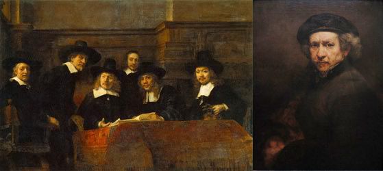
Left: Rembrandt van Rijn (1606-1669)
Syndics of the Draper's Guild
1661
75.4 in x 109.8 in
Oil on canvas
Rijksmuseum, Amsterdam
Right: Self-portrait
1659
Oil on canvas
33.3 in x 26 in
National Gallery of Art, Washington DC
-------------------------------------------------------------------------------------------------------------------------------------------------------------
The Desecration of Rembrandt's Gentle Men
By: Kidist P. Asrat
Rembrandt was commissioned to paint many group portraits of relatively wealthy and influential members of society from the guilds, town councils and other civic institutions of 17th century Holland. His group portrait of the De Staalmeesters, known as Syndics of the Draper's Guild in English, portrays a group of tradesmen reviewing the quality of cloth samples. He shows us more than just a guild meeting.
He has submerged the protagonists with a gentle light and avoids stark contrasts and sharp demarcations, which were common in his earlier paintings. This blending of contrasts makes the men to appear more gentle – they are not tormented by dilemmas of Biblical proportions. They are but wealthy citizens trying to bring about civility and order through their dutiful influence. At the same time, these are men who make difficult and sometimes harsh decisions, and the caution and wisdom in their faces recognizes that they need to always be alert to their surroundings.
Technically, Rembrandt achieves this mixture of gentleness and caution with the natural chiaroscuro provided by the dark clothes and the contrasting white collars. The men's illumined (enlightened, intelligent) faces are lit up by the light reflected off their white collars. The costumes, as well as describing rank and status, become natural props aiding Rembrandt's technique of playing with light and dark contrasts, light and dark moods, light and dark personalities, and other psychological polarities.
Rembrandt is the master of painting technique, above all using light. He has placed muted gold everywhere, from the cloth on the table to the paneling in the back wall. The effect is a glow from undecipherable sources, portraying a subdued presence of wealth, since despite their austere clothing, and probably equally restrained passions, these are men have financial and social security.
Rembrandt's art is also full of movement. The rhythm of the white collars in Syndics of the Draper's Guildtake takes us from one side of the group to the other in gentle curves. Rembrandt wants us to see the men one after the other with this slow sweep of motion, where each man is distinct and individual.
The men appear surprised by an unexpected visitor. They are looking up, or around, at the visitor, and one guild member is standing up to acknowledge (confront?) the visitor. This puts a spontaneous tone to the painting, which a formal sitting couldn't.
Since we cannot see this 'unexpected guest', then could it be us, the viewers? In such a manner, Rembrandt includes us into his painting, and joins us, even several hundred years later, with his gentle men.
This invitation is for all, including postmodern writer Zadie Smith. But Smith is unable to accept this invitation with dignity and humility. Instead, she reciprocates by writing her inaccurate and mean-spirited book against Rembrandt which she titles On Beauty. Her protagonists and mouthpiece, art history professor Howard Belsey, is writing (or unable to finish writing) a book on Rembrandt titled Against Rembrandt. What struck me most about the book was its inaccuracies, starting with the title. The whole book is a treatise against beauty; a book 'on beauty' whose main character hates Rembrandt.
Ultimately, I realized that Zadie Smith is unable to discuss beauty. Along with a lack of real knowledge on the subject, and on Rembrandt, she has no sensitivity toward beauty. In fact, overall, she is anti-beauty. Just like the anti-Rembrandt Howard.
I think this is the danger of this post-modern world, this multicultural world from which Smith hails, as evidenced in her second novel White Teeth. She personifies the contemporary writer or artist who doesn't want to spend the time doing the serious work, but would rather use an idea, a rebellious treatise against beauty, for example, or the chaotic world of multicultural London in White Teeth, to write rambling, imprecise and incomplete books. But her critics are equally lazy, or they've thrown out whatever standards they have to participate in the anti-beauty and anti-civilization treatises that "artists" and "writers" like Smith are advocating.
But the problem is more serious than a second-rate writer spilling out some angst. It is the sign of our times that people who profess to work against beauty are hailed as our cultural icons. With a careless sweep of the pen (or brush), they discredit centuries of learning and tradition. It takes little energy to destroy, but much energy to build. With one swoop of an explosive, a whole skyscraper can be brought to rubble. But to build that edifice takes years if not decades.
Beauty's progress has not been decades, but several millennia. Its slow evolution, building on the best of its past, has brought us wonders on earth. Within the last one hundred years, this process has had a potent grenade thrown at it, and we are beginning to see the desolate replacements, with the ruins not far behind them.
Smith's new book, NW, as in: "Northwest London, a council-flat heavy area in which Caribbean immigrants have gradually displaced the shanty Irish" is described as:
Smith could have redeemed herself by constructing a precise and artistic Rembrandt-like oeuvre. Instead, what we get from her is a lazy mesh of scrawls, hardly even a sketch. What would Rembrandt, strict and observant, think of the desecration of his paintings by second-rate writer Zadie Smith?
-------------------------------------------------------------
1. Cooke, Rachel. 2012, August 26. NW by Zadie Smith – review. The Guardian. http://www.guardian.co.uk/books/2012/aug/26/nw-zadie-smith-review
Left: Rembrandt van Rijn (1606-1669)
Syndics of the Draper's Guild
1661
75.4 in x 109.8 in
Oil on canvas
Rijksmuseum, Amsterdam
Right: Self-portrait
1659
Oil on canvas
33.3 in x 26 in
National Gallery of Art, Washington DC
-------------------------------------------------------------------------------------------------------------------------------------------------------------
The Desecration of Rembrandt's Gentle Men
By: Kidist P. Asrat
Rembrandt was commissioned to paint many group portraits of relatively wealthy and influential members of society from the guilds, town councils and other civic institutions of 17th century Holland. His group portrait of the De Staalmeesters, known as Syndics of the Draper's Guild in English, portrays a group of tradesmen reviewing the quality of cloth samples. He shows us more than just a guild meeting.
He has submerged the protagonists with a gentle light and avoids stark contrasts and sharp demarcations, which were common in his earlier paintings. This blending of contrasts makes the men to appear more gentle – they are not tormented by dilemmas of Biblical proportions. They are but wealthy citizens trying to bring about civility and order through their dutiful influence. At the same time, these are men who make difficult and sometimes harsh decisions, and the caution and wisdom in their faces recognizes that they need to always be alert to their surroundings.
Technically, Rembrandt achieves this mixture of gentleness and caution with the natural chiaroscuro provided by the dark clothes and the contrasting white collars. The men's illumined (enlightened, intelligent) faces are lit up by the light reflected off their white collars. The costumes, as well as describing rank and status, become natural props aiding Rembrandt's technique of playing with light and dark contrasts, light and dark moods, light and dark personalities, and other psychological polarities.
Rembrandt is the master of painting technique, above all using light. He has placed muted gold everywhere, from the cloth on the table to the paneling in the back wall. The effect is a glow from undecipherable sources, portraying a subdued presence of wealth, since despite their austere clothing, and probably equally restrained passions, these are men have financial and social security.
Rembrandt's art is also full of movement. The rhythm of the white collars in Syndics of the Draper's Guildtake takes us from one side of the group to the other in gentle curves. Rembrandt wants us to see the men one after the other with this slow sweep of motion, where each man is distinct and individual.
The men appear surprised by an unexpected visitor. They are looking up, or around, at the visitor, and one guild member is standing up to acknowledge (confront?) the visitor. This puts a spontaneous tone to the painting, which a formal sitting couldn't.
Since we cannot see this 'unexpected guest', then could it be us, the viewers? In such a manner, Rembrandt includes us into his painting, and joins us, even several hundred years later, with his gentle men.
This invitation is for all, including postmodern writer Zadie Smith. But Smith is unable to accept this invitation with dignity and humility. Instead, she reciprocates by writing her inaccurate and mean-spirited book against Rembrandt which she titles On Beauty. Her protagonists and mouthpiece, art history professor Howard Belsey, is writing (or unable to finish writing) a book on Rembrandt titled Against Rembrandt. What struck me most about the book was its inaccuracies, starting with the title. The whole book is a treatise against beauty; a book 'on beauty' whose main character hates Rembrandt.
Ultimately, I realized that Zadie Smith is unable to discuss beauty. Along with a lack of real knowledge on the subject, and on Rembrandt, she has no sensitivity toward beauty. In fact, overall, she is anti-beauty. Just like the anti-Rembrandt Howard.
I think this is the danger of this post-modern world, this multicultural world from which Smith hails, as evidenced in her second novel White Teeth. She personifies the contemporary writer or artist who doesn't want to spend the time doing the serious work, but would rather use an idea, a rebellious treatise against beauty, for example, or the chaotic world of multicultural London in White Teeth, to write rambling, imprecise and incomplete books. But her critics are equally lazy, or they've thrown out whatever standards they have to participate in the anti-beauty and anti-civilization treatises that "artists" and "writers" like Smith are advocating.
But the problem is more serious than a second-rate writer spilling out some angst. It is the sign of our times that people who profess to work against beauty are hailed as our cultural icons. With a careless sweep of the pen (or brush), they discredit centuries of learning and tradition. It takes little energy to destroy, but much energy to build. With one swoop of an explosive, a whole skyscraper can be brought to rubble. But to build that edifice takes years if not decades.
Beauty's progress has not been decades, but several millennia. Its slow evolution, building on the best of its past, has brought us wonders on earth. Within the last one hundred years, this process has had a potent grenade thrown at it, and we are beginning to see the desolate replacements, with the ruins not far behind them.
Smith's new book, NW, as in: "Northwest London, a council-flat heavy area in which Caribbean immigrants have gradually displaced the shanty Irish" is described as:
...a novel that feels unfinished and brandishes its uncertainties. In the essay "That Crafty Feeling," Smith compares the process of tricking herself into writing a novel to erecting scaffolding to construct a building. In NW, it's hard to tell where the scaffolding ends and the finished work begins: Perhaps that is the point (1).No, there is no "perhaps." That is the point.
Smith could have redeemed herself by constructing a precise and artistic Rembrandt-like oeuvre. Instead, what we get from her is a lazy mesh of scrawls, hardly even a sketch. What would Rembrandt, strict and observant, think of the desecration of his paintings by second-rate writer Zadie Smith?
-------------------------------------------------------------
1. Cooke, Rachel. 2012, August 26. NW by Zadie Smith – review. The Guardian. http://www.guardian.co.uk/books/2012/aug/26/nw-zadie-smith-review
Subscribe to:
Posts (Atom)